Jennifer McGuire: 5 ways to Add Gold Foil

screen-shot-2017-01-27-at-2-19-58-pm
Clip from Jennifer McGuire’s video: 5 ways to Add Golf Foil. This is using the “foil with dies technique.

I am currently designing wedding invitations and I have been looking at a lot of companies’ invitation designs for inspiration. One of the qualities that I’m loving is the use of foil. Adding foil to some of the type or pattern of a simple design adds a really beautiful touch. I wasn’t sure if using foil in my designs could be done at home without some sort of special printer or technique, but I was wrong! I watched this video last night where designer Jennifer McGuire demonstrated 5 different ways to add foil to your designs. The last technique, using a laser printer and laminator seems like the best option out of the five. This is something I would really like to try, if not for my wedding invitations, definitely in future projects.

To watch the video please click here.
To view her blog post on this top please click here.

Hi there!

My name is Sarah Tucker. For my last graphic design class in college, my awesome professor, Kathy, had each student in the class create a blog. We had required posts about certain topics and our finished projects. I’m grateful for these past assignments, because I have never been much of a writer, or a blogger but I am learning that posting about what I’m learning or interested in right now is pretty fun. It’s a great way to document progress on work, comment on research, and share ideas. With that being said, I hope to continue using this blog, sharing with you my current projects/interests and anything else that might be worth a post!

Brochures

This is a series of three brochures I created for a graphic design project. The first is a barrel fold, the second is a parallel fold, and the third a gate fold. All of these photographs and collections are form the New York Public Library.

screen-shot-2016-12-16-at-10-58-47-amscreen-shot-2016-12-16-at-10-58-52-am

screen-shot-2016-12-16-at-10-58-06-amscreen-shot-2016-12-16-at-10-58-16-am

screen-shot-2016-12-16-at-10-59-12-amscreen-shot-2016-12-16-at-10-59-25-am

Find the image collections from the New York Public Library here.

Independent Project: B.A.S.I.C.

For my Independent Project, I created a series of posters, square hand-out cards, and a new tri-fold board for B.A.S.I.C. B.A.S.I.C. stands for “Brothers & Sisters in Christ” and it’s a super fun club on campus! These items were created for next semester’s meetings. The posters are 8.5″x 11,” the cards are 2.75″ x 2.75,” and the tri-fold board is 36″ x 48.”

I’m the PR for B.A.S.I.C. so I’ve made a lot of posters for the club over the past couple of years, but these are my favorite thus far. The requirements for making the posters included the using the B.A.S.I.C. logo (logo and large b), including social media contacts, the slogan “Be a part of something bigger”, the location, and the SA logo. Since before I was a member of Basic, the typically used font for the posters was always Myriad Pro. I used Myriad Pro and Myriad Pro Semibold here. For the blitz cards, I used the Futura typeface.

I wanted these posters to feel unified, but also feel very different, so they catch students’ eyes as they walk through the halls or look at the cork boards around campus. All three posters have the same layout but use different colors (other than the navy because that is constant in all of them) and different designs. For the patterns inside the b, the leaves, flowers, and waves, I used watercolor on paper. I then took photographs of my paintings and brought them into Lightroom to fix the lighting in the photos. I created a clipping masking using the pattern photo and the large b in illustrator and it creates these really beautiful bs! I put a white b behind the patterned one because I make each photo have some transparency. I traced each photograph of the patterns in illustrator and that’s where I got the leaf and waves vectors from. I really enjoyed mixing studio with graphics in these posters.

The tri-fold board was pretty fun to make. I made a few navy paintings with mint leaves in acrylic on paper. I then traced the letters on the paintings and cut them out. This took a very long time and I thought of typography before digital means… it was pretty cool to see the letters when they were all finished though, looking like the logo. I left the bowls of the letters, etc. out as they are very small and I didn’t want to risk ruining letters. I made some more watercolor paintings of the leaves to be layered with the photographs that will be places on the board. These cutouts of the painting are 4″ x 6.” I added some cards for Easter last year, our mission statement, this semester’s BASIC Conference booklet, and some other items. Items like the BASIC conference booklet, the Easter card, etc. will be updated when they get them in next semester. The board does not contain photographs right now, but again, they will be layers with the leaf watercolors. The tri-fold board is used at the club expo and at our weekly BASIC meetings. It essentially follows the club to any event we do! Pictures will be added to the board before it is used on these occasions.

The Blitz cards are typically handed out at the club expo each semester, when we do tabling, and at BASIC meetings for people who want to invite friends or are new and want to have it as a reminder of our meetings.

basic1.jpg

basicblitz

biblestudy

biblestudbasicblitz

mensbiblestudy
biblestudmenbasicblitz

img_8184

img_8185

img_8190

fullsizerender-10

img_8188

fullsizerender-11

fullsizerender-12

fullsizerender-13

fullsizerender-14


img_8212

img_8213

img_8215

img_8216

img_8217

img_8218


Reaction to the Helvetica Movie

helvetica-film

A couple of classes ago, we watched the Helvetica movie. Helvetica was created in 1957 by Swiss typographer Max Miedinger. Helvetica is a clear, rational typeface. It seems like designers either love, or strongly dislike using the Helvetica typeface. This video showed us designers with a lot of different backgrounds, styles, and opinions.


matthewcarter.jpg
Matthew Carter.

Matthew Carter is a modernist who shared in the video. Matthew Carter created Georgia and Verdona, among other typefaces. His father is Harry Carter, who was a typographer himself. Carter was educated in creating type by hand, before digital type.

georgia-modern-serif-fonts
Matthew Carter released the Georgia typeface in 1996.
paulascher
Paula Scher.

Paula Scher is a post-modernist who shared in the video. Paula Scher is very much against Helvetica. She describes Helvetica as used for persuasive corporate culture. Scher is one of the designers who wanted to move away from the so common use of Helvetica. She says this about overused typefaces:

“The more you see it, the more you can appreciate when it’s terrific.”

This is very true. Although Helvetica may be used often, and may seem generic, the fact that it’s seen in so any places does give the viewer the ability to see where it’s used beautifully, and where it’s used carelessly. Below are some examples of Paula Scher’s work:

paulaschermag
Posters for the Public Theater by Paula Scher.

I personally like Helvetica. It’s not my go-to font, but I like the simplicity of it, and its smooth, non-decorative look. It’s very modern and it works great for logos or advertising because it’s easy to read.

Research for packaging design at Hannaford

In October, our class took a trip to Hannaford to do some research on packaging design. I was given the category of household goods, which includes lightbulbs, laundry/dishwasher products, sponges, matches, kitchen tools, etc. I decided to go with laundry products; more specifically: the Hannaford brand fabric softener sheets.

Here are the questions I answered about the product at the store:

1a. What are the products they are shelved with? What is the packaging of these products like? What do they have in common. Is there a general personality for these products? Do you see certain elements or motifs repeated amongst the products?

FullSizeRender.jpg

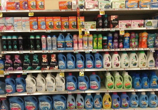
The Hannaford fabric softener sheets are shelved with other fabric softener sheets, and places on shelves above liquid fabric softeners. generally, the packaging for these products use bright colors and bold text: blue, orange, pink, yellow, and green. A lot of these products either a soft, or bold personality. The downy products all feel very soft, like you would want your clothes to be. The gain and bounce products feel a little more bold and in your face, due to the bright orange. A lot of these products have flowers on their packaging: the Downy Infusions, the Bounce Dryer sheets on the top shelf, and one of the products on the bottom shelf in the right hand corner.

1b. Amongst the products it is shelved with, which is the nicest example of packaging of this type of product? Is there a package there that is innovative and shows a greater emphasis on design?

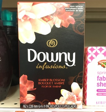
The Downy Infusions Fabric Softener Sheets package is the best example of packaging of this type of product. The bright colors and bold lettering are the expected style for this kind of product, but I feel that the look is outdated and could use a change. The Downy Infusions products have a new and beautiful look to them, with the black background and the unique colors of the flowers. It’s inviting, and definitely will draw the eye of people who choose their products based on the prettiest design! The other Downy products are also better examples of how to package this product vs. Bounce and Hannaford and the other products. They use light blue and pink creating a soft feel for the product, which really shows what the product is meant for… making your clothes nice and soft and cozy. Hannaford’s fabric softener sheets are placed right next to this product on the shelf.

fullsizerender-2

1c. Is there an established color scheme that consumers are familiar with for this type of product? (example: blue for some brands of pasta, red for others. Cleaning products extremely bright)

For the most part, laundry products a have bright colored packages. I saw a lot of blue, orange, pink, yellow, and green. The orange is definitely the brightest.

1d. What are the established branding conventions of the graphics that are too important to loose in a redesign?

All of the fabric softener sheets have the the same rectangular box size. So that is something that I kept the same in the redesign. The scent, weight, amount of sheets, and size are also important to display in the design. I kept the same information on the new design as was on the old design, and put the same information on the same flaps of the box, for majority of the information; while altering a few things.

1e. What typography conventions are used?

Sans serif  type is most commonly used in these products. A lot of the products, like Bounce and Gain use bold, blocky lettering for the brand name. Downy uses a more toned down, type. The Downy Infusions product uses script, which I really enjoy looking at.

2. Is there a package that is engineered in a innovative and inspiring container. There are many new technologies being used in package design. (example: see enspired chocolate and soymamelle) Make notes.

The Downy Infusions bottle has a very unique shape compared to the other Downy and Gain products. The dryer sheets all use the same style box.

3. Is it an areas of consumer goods that seems to be embracing new and innovative packaging?

Downy Infusions is using a new and innovative packaging style. The colors are very different and unique. It’s a very modern style that is appealing to younger people It is much more beautiful than the other designs, it almost reminds me of a wedding invitation, with the script type and the flowers.

4. Is there an example that seems to be stuck in an older era of packaging and needs new design?

The Hannaford brand is rather boring and bland. It is simple text with the image of the colored towels. I feel that so much more could be done with this product to make it more appealing to the customer.

5. How many different substrates (material the package is made of) can you notice?

All of the fabric softener sheet boxes are made out of a thin cardboard material.

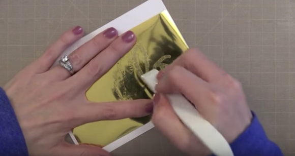
6. How many different specialty printing methods (foil, embossed, debossed) can you notice?

I didn’t see any foil, embossing, or debossing on any of these products. They do all have perforated edges where the box is opened.


Design and Illustrate a Label with Jon Contino, from Skillshare

screen-shot-2016-12-10-at-2-02-22-pm

“Label designing, as different as it is is still a very unique and special art form.”

In the second part of the lesson, My Favorite Hand-illustrated Labels, Jon gave three different stages in creating a label design:

  1. Research: Research the product’s competition, products, style, history of the company, and where the product will sit on the shelf.
  2. Sketching: Sketch your product. How will it exist? You want to make sure that the correct items are emphasized.
  3. Finalizing: Self critique yourself, get ready for production, go back to your research and make sure you’re on track with the goals.

He shows us some old items with labels he really likes, a whiskey bottle and a whiffle ball box. He points out that on the whiffle ball box, there are only two colors, but it looks like three because white acts as a color. It’s so cool that you can use the white to add that extra dynamic to your design! You can also use transparencies to create different colors out of the existing color.

Screen Shot 2016-11-15 at 5.12.44 PM.png

Jon Contino’s favorite kind of labels to create are apparel labels. He shows us some tags that have a nice tea stain and a distressed look that he created by using rocks in a dryer. I love homemade, organic look of this tag. He says label design like this is all about going out and finding a way to create it in the simplest way possible.

screen-shot-2016-11-15-at-5-33-04-pm

The third part of the lesson is called Translating  your mood board in to Sketches. He talks about how the company who hires you to create a label can’t communicate exactly what they want you to do. The best thing for a client to do is send pictures of other labels and brands that they like to five you ideas and inspiration. They can create a mood board for you. You are going to take all of the elements they give you and develop a language for the company. You need to find a way to translate all of the visual information into one  label in order to tell the story of the product.

“Clients should give you idea of aesthetics in visuals so you can know where they are coming from.”

He sketches out a wine label with us. He figures out where different items will go and starts drawing images and text. After he’ done he points out the most important area vs. less important area. He points out the requirements, the 750 ml, 2010, etc. that that customer will want to see.

The last part of the lesson is Working with your Top Design. At this point we have a lot of different ideas to compare. They have different hierarchies, layouts, looks on the shelf, and all together styles.

After choosing the best design to represent the product thus far, Jon creates a final black & white ink piece. Black and white is great because it creates a high contrast, so it will be easy to separate in Illustrator. He brings the image into Illustrator and creates a vector. Now that the design is on the computer, it will be easy to play with different elements and colors and mix and match different aspects.

Here you can see the comparison of some of Jon’s different ideas. The colors and style relate back to the Argentina flag theme. The right image is the final design.

I enjoyed this video. Jon Contino did a great job of getting his point across in a concise way. I also like his hand-drawn style.

View the video here.